A graph or chart is a diagrammatic illustration of data represented by symbols, such as bars in a Bar Chart, lines in a Line Chart, or slices in a Pie Chart.
Data can be easily and quickly presented in a visual and meaningful format using the Chart Designer.
To add, edit or insert a Report Chart click the Report Designer tree-view and select a Report Section or Report Group and then click the menu Edit | New, Insert or Edit Chart.

Enter the details for the Report Chart and then open the Chart Designer to add chart series and areas.
The Build Option property controls the output of the Report by including the content in HTML and / or PDF builds.
Report Chart Designer
The Chart Designer allows chart areas, legends and series to be defined using the property pages.
Report Charts should be bound to the Report Data Source or a Report Data Context.

A list of Data Tables should be selectable from the drop-down list for chart binding under the Table Name property.
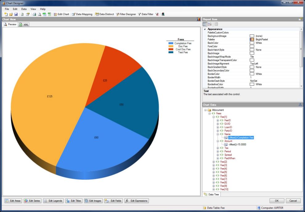
Various different chart series and types can be selected including bar, line, column and pie as illustrated here.
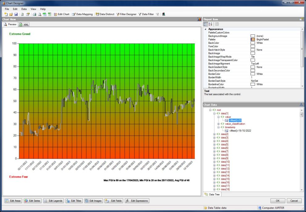
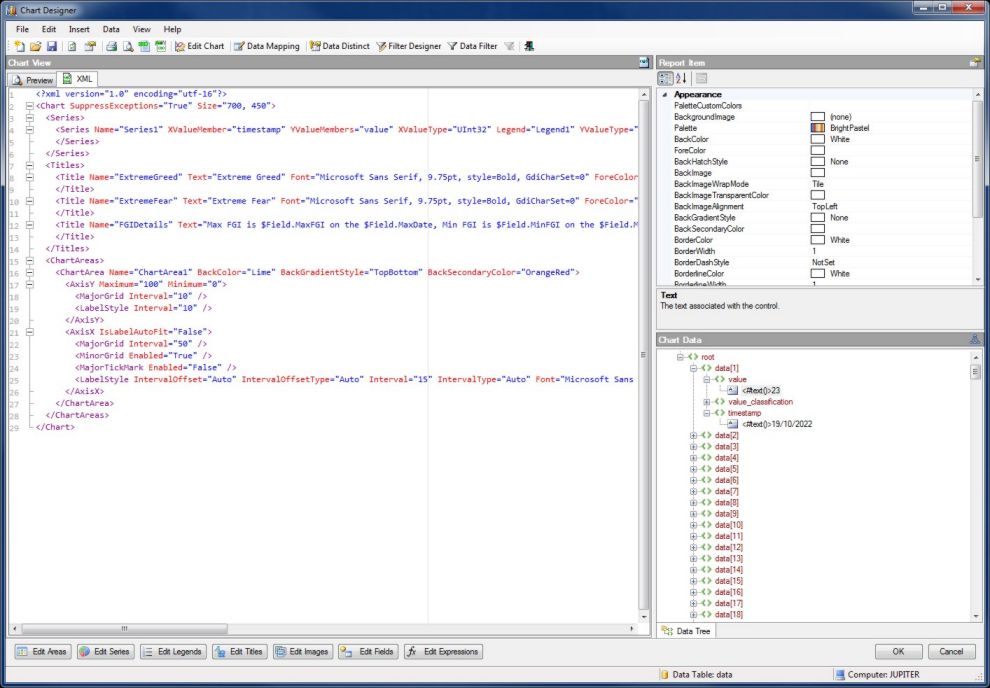
Chart design and structure is serialized on the XML Tab in machine readable text format.
Click Edit Chart button or right click on the Report Chart to open the properties for editing.

Two important properties of the Report Chart are the Series and ChartAreas properties, both of which are collection properties.

Select the XValueMember and YValueMembers from the drop-down lists.
Many other settings can be defined to customise the Report Chart appearance and style.

Adding legends to the chart is easy with the Legend Collection Editor.
Data Filters can be applied to Report Charts for filtering and sorting.
To enable Data Filtering click the Data Filter (...) property button to open the filter properties page.
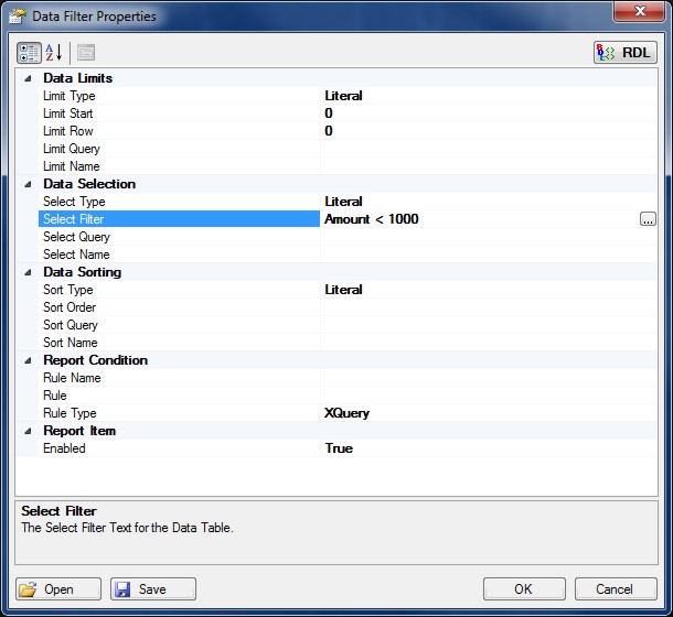
Data Filters can be used to select and sort data from Data Tables returning specific results and / or rearranging into some meaningful order.
For example, if a Select Filter is applied for Fee Name = 'Cool Doc Fee' then only the data with this criteria will be output in the Report Chart.
Report Queries as either an XQuery or Python expression to query the Report Data can also be used for Data Selection, Data Sorting and Data Limits.
Data Row Limit
The number of Data Rows in the Data Table can be limited by specifying a Row Limit. Open the property page for the Data Filter and enter a limit for the Data Rows.
Data Distinct
Data Distinct determines how data is summarized in Report Charts with special functions for summarising data by Sum, Average, Count, Max, Min, First, Last and Exists.

Enable and choose the relevant Data Columns and function for the Data Table according to how the data needs to be summarised or presented.
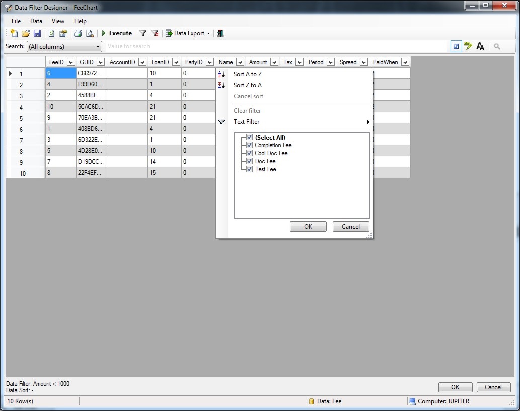
Data Filter Designer
The Data Filter Designer is a powerful tool to help with the design and application of Data Filtering and Sorting on Data Columns.
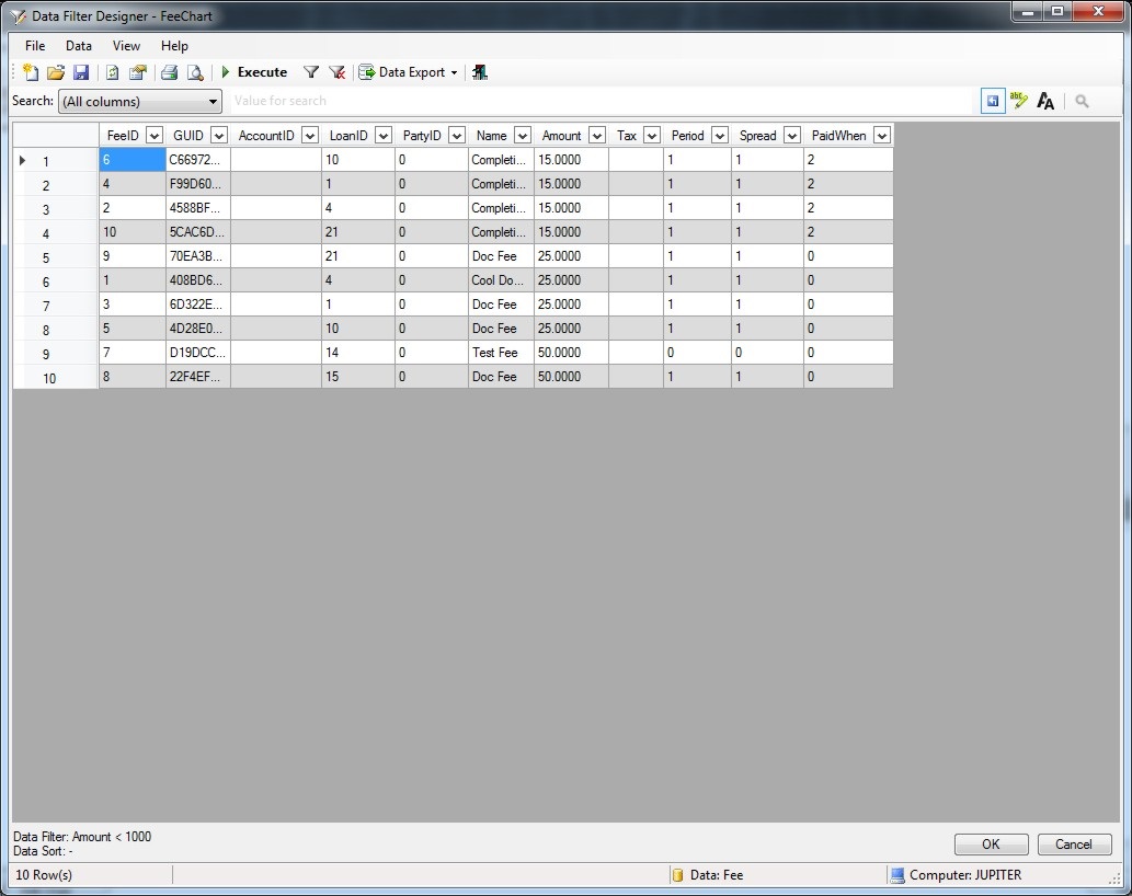
Select the Data Columns to filter and / or sort from the drop-down lists.
Click the 'Execute' button to view the filtered data output and then OK to apply to the Report Chart.
Data Source Mapping can be used to map data and add additional custom Data Columns to a Data Table using formulas, expressions and queries.
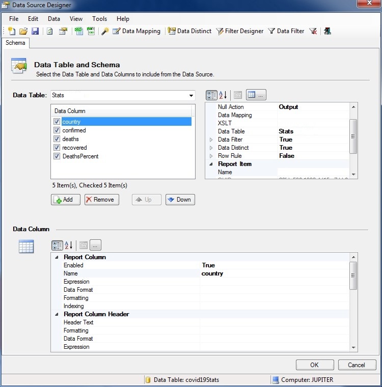
Add Data Columns to the Report Chart Data Mapping and design formulas, expressions and queries accordingly to create the custom data.
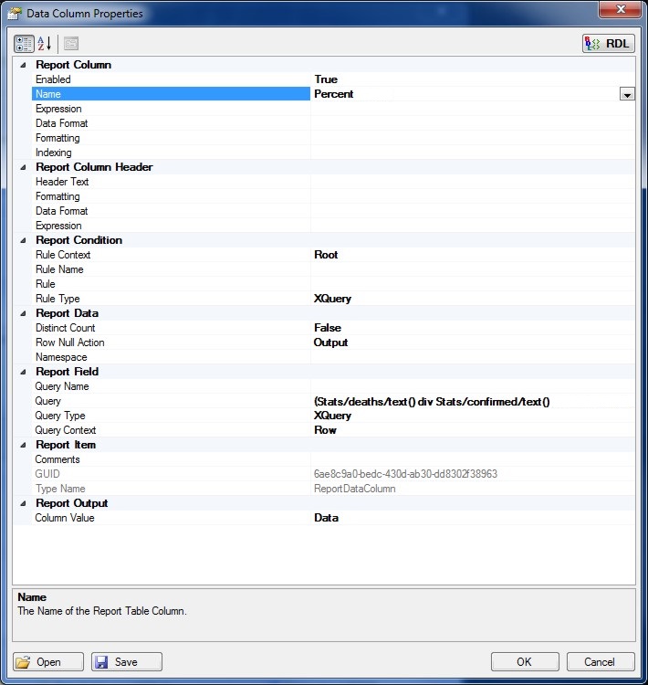
Click the OK button to add the Data Column to the Data Source Mapping.
Inserting a Line Chart into the Report
Report showing the share prices for IBM and took less than five minutes to create.

Report Data Manipulators
Report Data Manipulators provides methods to prepare and manipulate data for technical analysis, apply formulas on the data and prepare output data to be displayed as a chart.
Advanced formulas and financial analysis such as forecasting can be used to output forecast data and trends. Sorting, grouping and filtering operations can also be applied using multiple data manipulators.
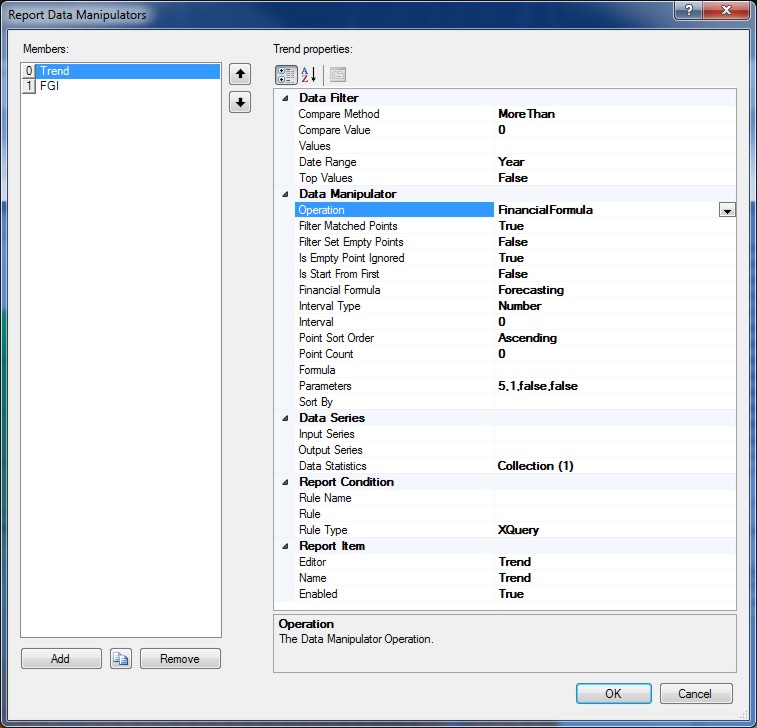
Adding the Data Manipulator for the operation of Financial Formula to forecast data using the specified parameters.
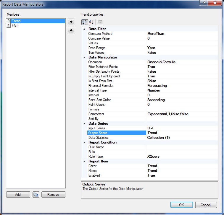
Specify the Input and Output series for the Data Manipulator on the Report Chart.
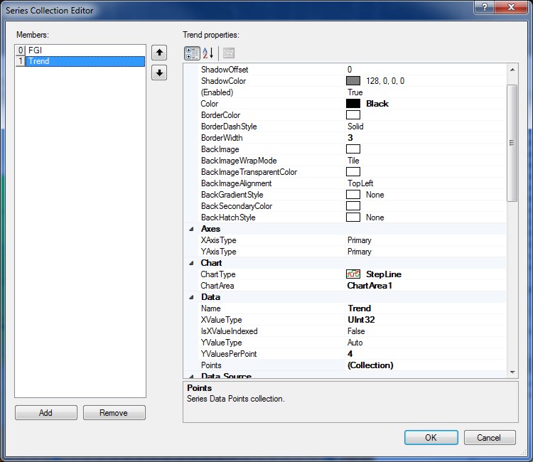
Adding the associated series to the Report Chart for the Data Manipulator.
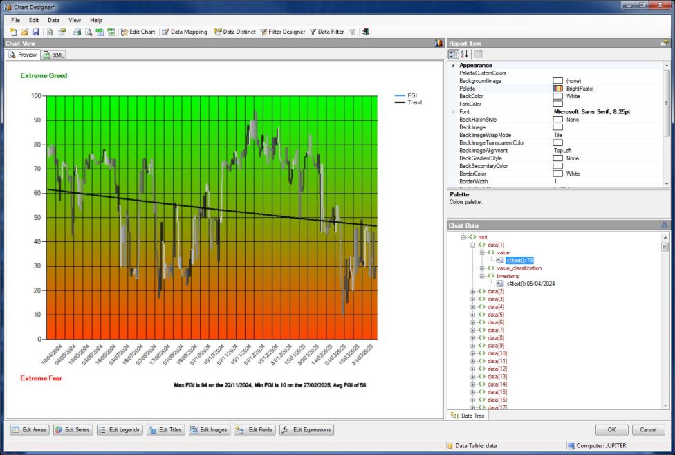
Previewing the Report Chart with the Data Manipulator applied showing the Trend series.
Multiple Data Manipulators can be applied to a Report Chart with different formulas and operations such as sorting, grouping and filtering.
Report Data Statistics
Report Data Statistics provides additional methods to make calculations on data using statistical formulas for technical analysis.
Advanced methods such as an ANOVA (Analysis of Variance) test to determine whether there is a statistically significant difference between the mean values of two or more groups of data.
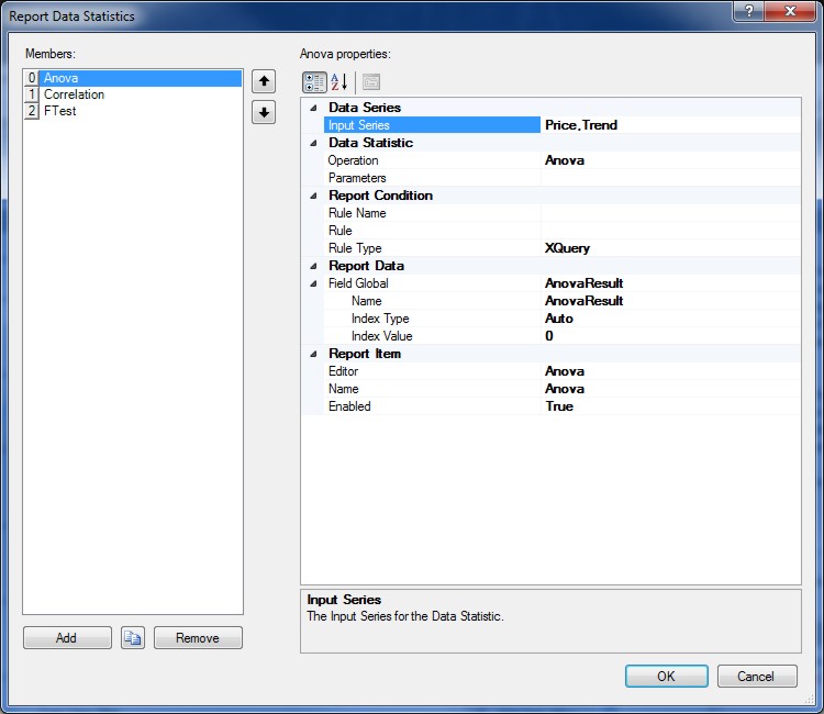
Specify the Input Series for the Data Statistic and the Report Data Field Global to store the Output Data.
Multiple Data Statistics can be applied to a Report Chart with different statistic formulas and operations.
Report Charts can be defined with Report Data Contexts which are used to drive and build Report output content and also allows the consolidation and integration of data from multiple different sources and types such as API's, websites and data files to be read and used in the Report.
Data Contexts can be applied to specific Report elements allowing data in XML documents to be contextually enumerated. The default Data Context is the Report Data Source (XDM) root node and if no Data Context is specified then the current Report Data Source will be used.
To apply a Data Context to a Report element expand the Data Context property or click the (...) property button and specify the Content Type as either a Literal (Constant) or a File.
Context Types can be either XQuery, Python, XML, XLS, XLSX, CSV, JSon or HTML.
The Report Chart can use the Report Data Source or a custom Report Data Context specified by the Data Context property.
Reporting also features Extensible Stylesheet Language Transformations (XSLT) which is a language for transforming XML documents into other XML documents or other formats such as HTML for web pages or plain text.
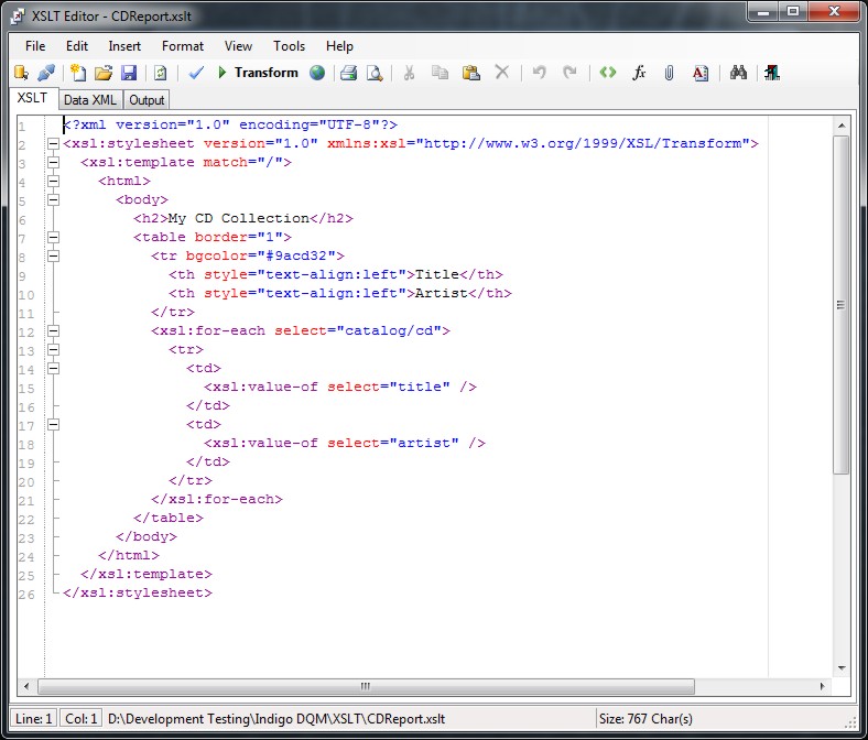
To specify a Report XSLT to transform the Report Chart Data Context click the XSLT (...) property button.
Report Charts can also contain a collection of Report Fields which are used to query, format and display Report Data.
XQuery or Python can be used to query Report Data and display it in the form of Report Fields.
To add Report Fields to a Report Paragraph click the Fields (...) collection property button to open Report Fields Collection Editor.

Enter the details for the Report Field using the property grid. Clicking the Query (...) button will open the relevant Query Designer / Editor.

There are many options for formatting Field Data. Select the best formatting option to display the Field Data according to your requirements.
Data can be formatted for Boolean, Time, Date, Number, Currency and Strings.
Regular Expressions and Inbuilt Functions can also be applied to Data Formats to manipulate and extract Data.
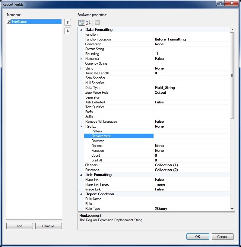
Data Formats can also be declared globally in the Report and used throughout the Report to apply common Data Formatting options. If a global Data Format is available it will be shown in the drop-down for Field Formatting under Format Name.
Report Expressions are mathematical equations and formulas that are evaluated by the Indigo DRS Expression Evaluation Engine (EEE).
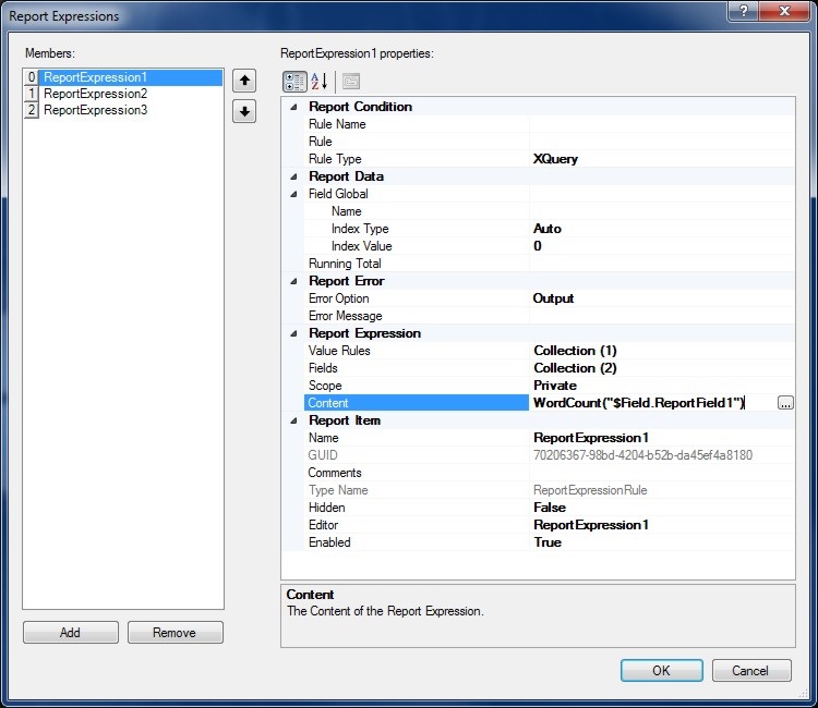
The Expression Editor allows Report Expressions to be developed and evaluated.
Both symbolical and numerical computations are supported allowing complex mathematical equations and formulas to be calculated. Scientific, engineering, finance and mathematical expressions can be evaluated and included in the Report.
Report Rules are conditional XQuery or Python expressions that determine if Report content is enabled and applied to the build. Rule based queries return a Boolean that is either True or False and can query the Report Data Source and other Report Data Contexts. Rules are used for controlling the flow, visibility and activation of reporting content.
Report Rules if empty or null by default will always return True.
Report Namespaces are used for providing uniquely named elements and attributes and is a mechanism to avoid name conflicts by differentiating elements or attributes within an XML document that may have identical names, but different definitions. If the Report Data Source contains namespaces they can be applied to the XQuery Processor.